I was shattered by the Great Danish Capitulation to the invading gretas. Their problem was that they made their charts too clear, and attracted the attention of the hockeystick slasher.
Anybody left alive who shows relevant charts must make them obscure enough that the philosophers can't understand them. So, I have switched charts.
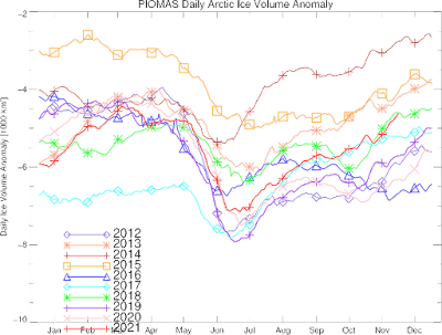
This chart still shows our current ice volume is charging up. The rate of increase is as important as the actual position, which is dependent on previous years.
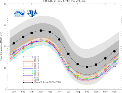
This chart might be better.
This year is entering the main band. It takes a while for the ice to accumulate, and that's why I am more interested in the rate. If they plotted rate, then it would be too obvious to the slashers.
This fall and early winter aren't really living up to my hype. There's a lot of residual heat left in the equatorial belts, and we're getting it all. This heat energy will run out, and then we'll see something.
Next week we'll see the new NOAA results for world temps. They make that incredibly obscure, and you have to 'make' your own chart. If it looks bad, they don't say anything, if it's good, their PR department goes to town. Nasa only uses the total year chart, and this year might not be good for them. Then they can just leave that point out.
No comments:
Post a Comment