
This chart was used yesterday, but a slightly older version. Do no use this chart! It is coughing out a math-error hairball. I can't figure out if it is an Arctic ice thing, or the weird ocean chickenpox.

The sst anomaly maps has huge cankers overlaying cold water jets.

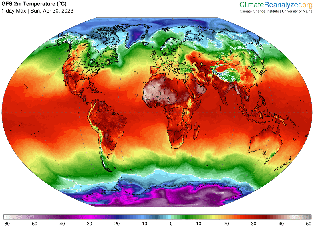
You can see from the 'straight' temperatures that there are no hot spots or precursors to El Nino. Just math errors.
For the media, it is best to go back to tiny heat waves right now. However, it's only really hot in Africa, and that doesn't get any clicks.
Do not cover the fact that Toronto is having miserable, cold rainy weather.
No comments:
Post a Comment