This is the simple Haywood chart put out by nooa. It shows that the world is cooling, no ifs, ands, or buts.
This is a weird chart from the same source. It plots just the months of May. There is no reason for this chart to exist, other than an option, if it shows global warming.
This is the real chart, month by month. This was always the 'go to' chart, before they got fancy. The 'hockey stick' was based on this chart. However, this is called an 'anomaly' chart, because they subtract a single number to change the baseline. And they do this for clarity. Otherwise, you'd have a big huge whitespace underneath. This is as far as I would take the concept of an anomaly chart.
But you can go nuts with an anomaly chart, especially with maps.
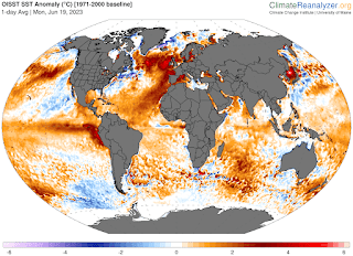
This is the world ocean anomaly chart. It is not a single number to subtract, but rather a complex map of averages, over time, and seasons. Look at the North Atlantic! It's practically boiling. And, of course, we have elnooa starting at the wrong place, and at the wrong time.
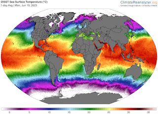
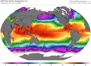
This is the world temperature 'clean' chart, without all the complex manipulation. Wow, the N Atlantic is freezing, and the Pacific Belt is cold as a snitch's teeth. Quite a difference! What to believe, what to believe...
For physics, we look at heat energy, and there is nothing in the Pacific. For the press, they'll look at anything they like. I'm not going against the groupthink here, that cuts me off of all readers. The ticktok dancers will come over and stomp me into the ground. Physics is giving a clear indication of a long, cold winter that will knock your socks off. The groupthink only does things with 20/20 hindsight.
I'm now reading a novel of 1716 in London, when the Thames froze over. Looked like 20 below, and a great story. We will see what happens this winter, when the Siberian Spill roars through the Greenland spillway. For now, it's summer, and for two months, you can't tell the difference between a hot or cold cycle. That will come in September, and big snow in November.
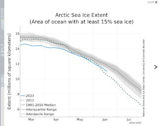
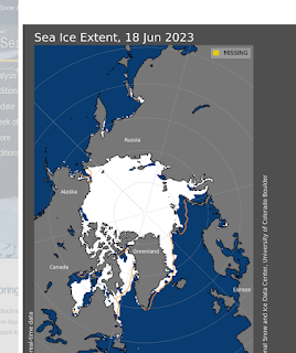
Now, this is a really bad, mucked up chart, that is still in the press. It's 60 to 60, and downplayed by a scientist in nooa itself. It has no meaning, but the press loves it.




.gif)




.gif)


.jpg)



.gif)
.png)

