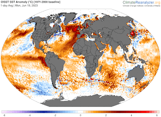
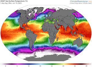
The ocean currents map is horribly late, but it never really shows anything beyond the thermal maps.
This is the anomaly map. They never show the base map, which subtracts from the 'pure' temperatures. Without that, I can't figure out what is going on. This map shows the oceans getting hotter without affecting the global temperatures, which is nuts.
The 'pure' temperatures are showing everything getting colder. Both the Atlantic and Pacific belts are sucking up Antarctic water to an amazing degree. I'm going to have to declare the anomaly map to be 'fudged'. Ha.
We continue our run to the amazing situation that I predicted -- All maps and charts showing increased warmth, while everybody sticking their heads out, and wondering why it is so cold.


No comments:
Post a Comment