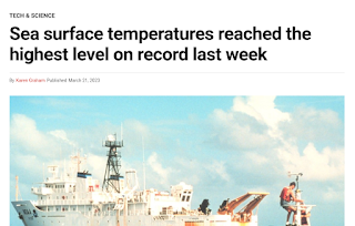
I am bashed down to the lowest depths of geophysics hell. I've been taunting all the warmies to produce a chart showing warmth, especially the world temperature chart, and the whole discussion of 1.5C.
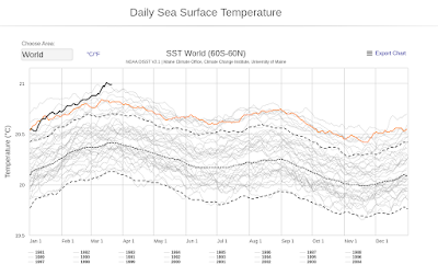
Now, from the ocean of available charts, they have plucked on that I've been looking at for a long time.
For years this chart faithfully plotted the cooling of the world. It was at a peak at 2016, and then has been going down as we cooled. Suddenly, it was zooming up, totally independent from the world temperature charts. How could this happen?
It was the momentous events that led to the drowning of California. People may ask what was happening, but they didn't get any answers, other than the standard -- 'Climate Change'. One in a million people might ask -- What was the mechanism?
They'll only get the answer here. There was a momentous energy shift, as much as anything like El Nino. The entire Arctic spilled all it cold air through Siberia and the Bering Str. During that time, all of Europe danced at how warm it was.
This cold air flooded the Pacific. I've never seen anything like that. The whole ocean became a mass of cyclones, all hitting California. The concept of how those temperatures were taken was blown away. The cold air struck low, and raised the hot air. The satellites recorded that as being warmer. It is a totally erroneous reading. As with all their 'charts of the day' we expect this to start falling rapidly.
Today's charts are tomorrow's fish wrap. When this chart falls, you won't hear a peep from the 'popular people'. On to digging up another chart! At least they used a chart, and will throw it away.
ps. just realized why the chart has a double bump. As the polar oceans freeze, they come off the chart, and only the warmer areas left. Not a good chart for mechanisms.


No comments:
Post a Comment