Reference
Subtitle - Global Warming Hypothesis Falls Out of Band
I am not denying anything. Carbon in the air is bad, bad , bad. However, I have been going more into the physics. Eventually, I want to write about how it all happened.
However, this is big news.
The yellow band is the hypothesis, with carbon warming included. The authors state that the carbon model is the only explanation they had for the rise in temperature. If it is a good model, then the actual data (black) should be jittering inside the band. El Nino threw it in for a while, but now it has really fallen out, and will be outside for the next 20 years.
When the observations go out of the band, then the hypothesis fails. Diehard warmies might reject this.
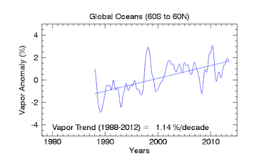
Since we aren't stating anything here, we look into the physics, just for fun. Here's the water vapour trend.
I love this, since water vapour is many times the thermal insulator that carbon is. They say that the carbon is responsible for this rise, in some magic manner. I won't go against magic!
This is the long-term trace of water vapour. If only they combined it with the long-term trace of ocean currents. But, they are specialists. Anyway, this map correlates exactly with a map of the long-term trace of ocean current vectors. Two bucks could get you that plot.
--enough for now.
ps. I'm quite happy that the physicists are poking their heads out from the trenches. Soon there will be something on convection and the lapse rate.


No comments:
Post a Comment