nasa has everybody enthralled by only using this plot.
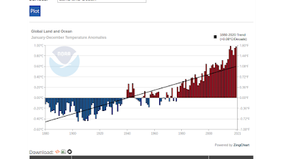
This plot uses the annual average, and I don't know how they calculate that. If you are looking at a trend, it is best to average as little as possible, as it hides things.
I use this plot, which is the average on the month. I think that's about as fine as you can go.
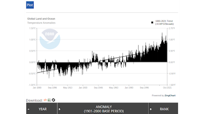
I love this plot, as it shows more fine detail, and I can associate each dip and peak with an oceanic event.
This is the plot you would use if you were arguing that the last few years since 2016 have been flat. Also note that on the upper graph, the alarmists use the projection of a straight line since 1980. These plots are from noaa.
ps. if you would acknowledge a short cycle of decades, and a long cycle of hundreds of years, then all fuss we have is a short cycle riding on the top of the long one.
No comments:
Post a Comment